← Back to Work
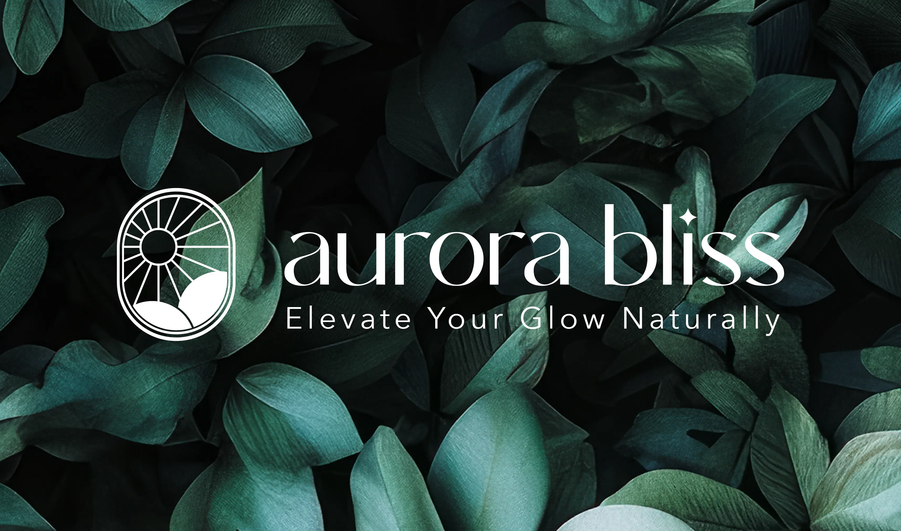
Aurora Bliss
Aurora Bliss
Brand Identity Design
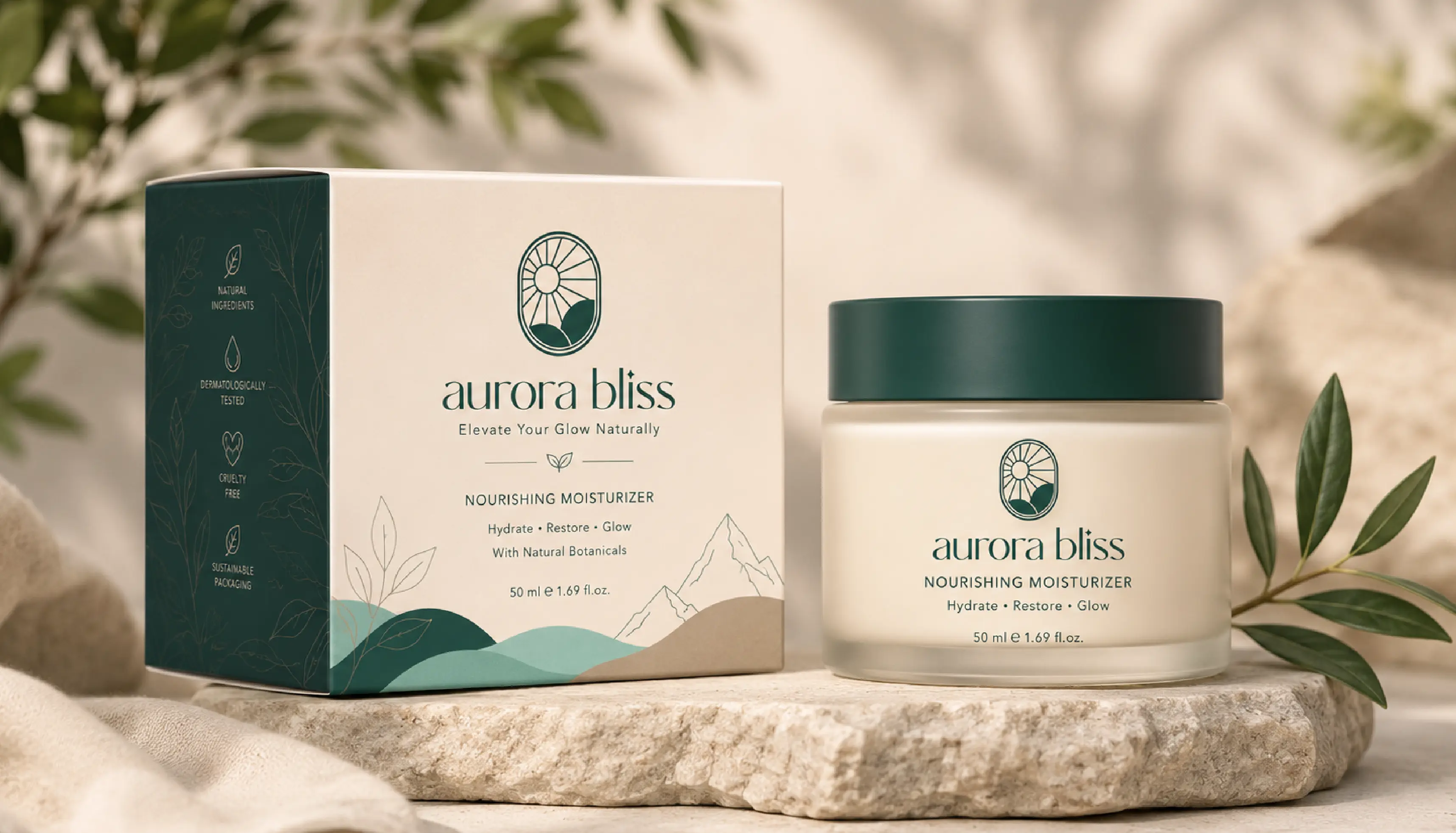
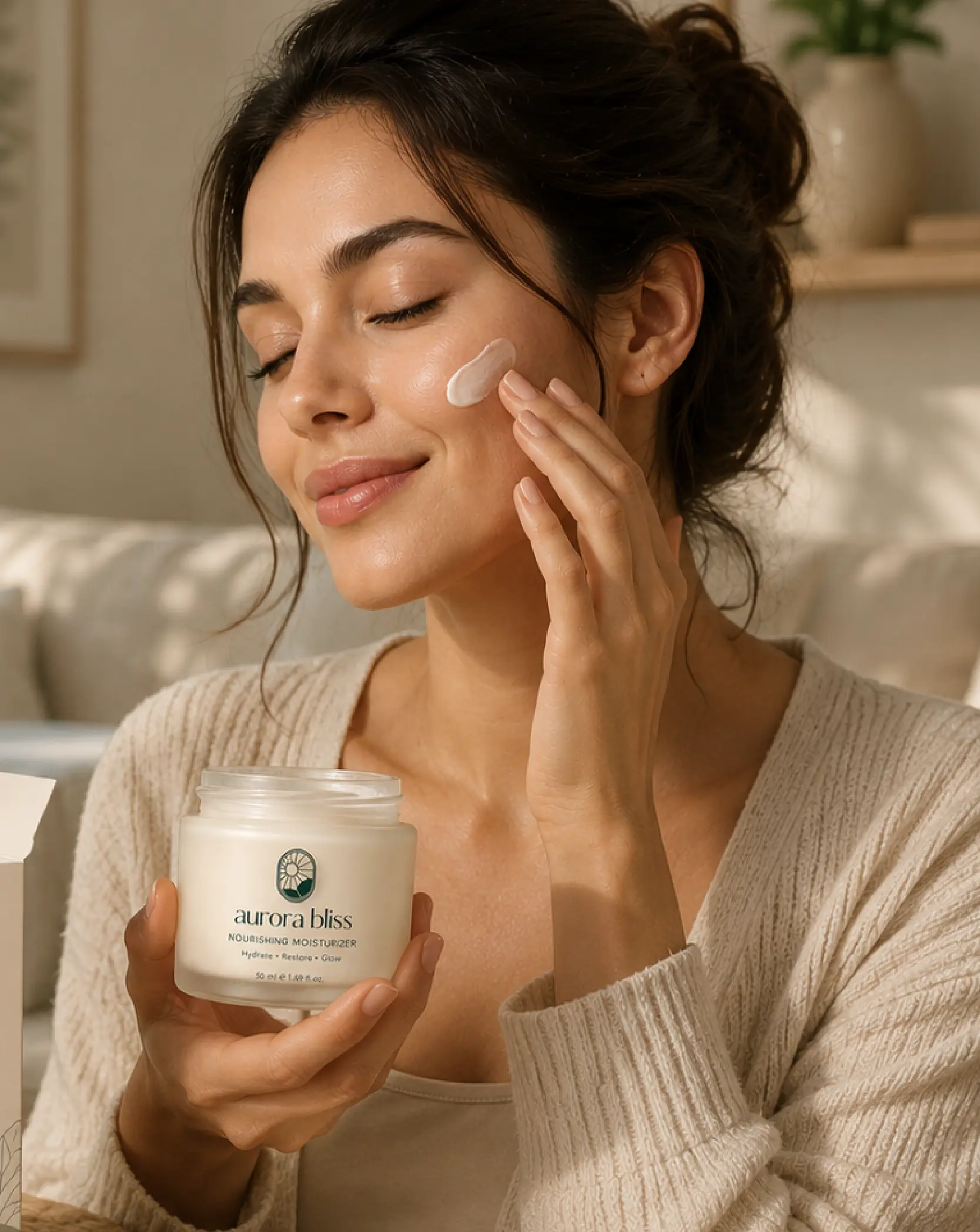
Aurora Bliss is a visionary skincare brand dedicated to harnessing the power of nature to create luxurious, eco-conscious products that nourish the skin and elevate the senses. Rooted in the belief that true beauty comes from balance and well-being, the brand combines natural ingredients with mindful formulations to deliver effective skincare experiences. Aurora Bliss is committed to sustainability, ethical practices, and helping individuals embrace their natural radiance through products that care for both people and the planet.
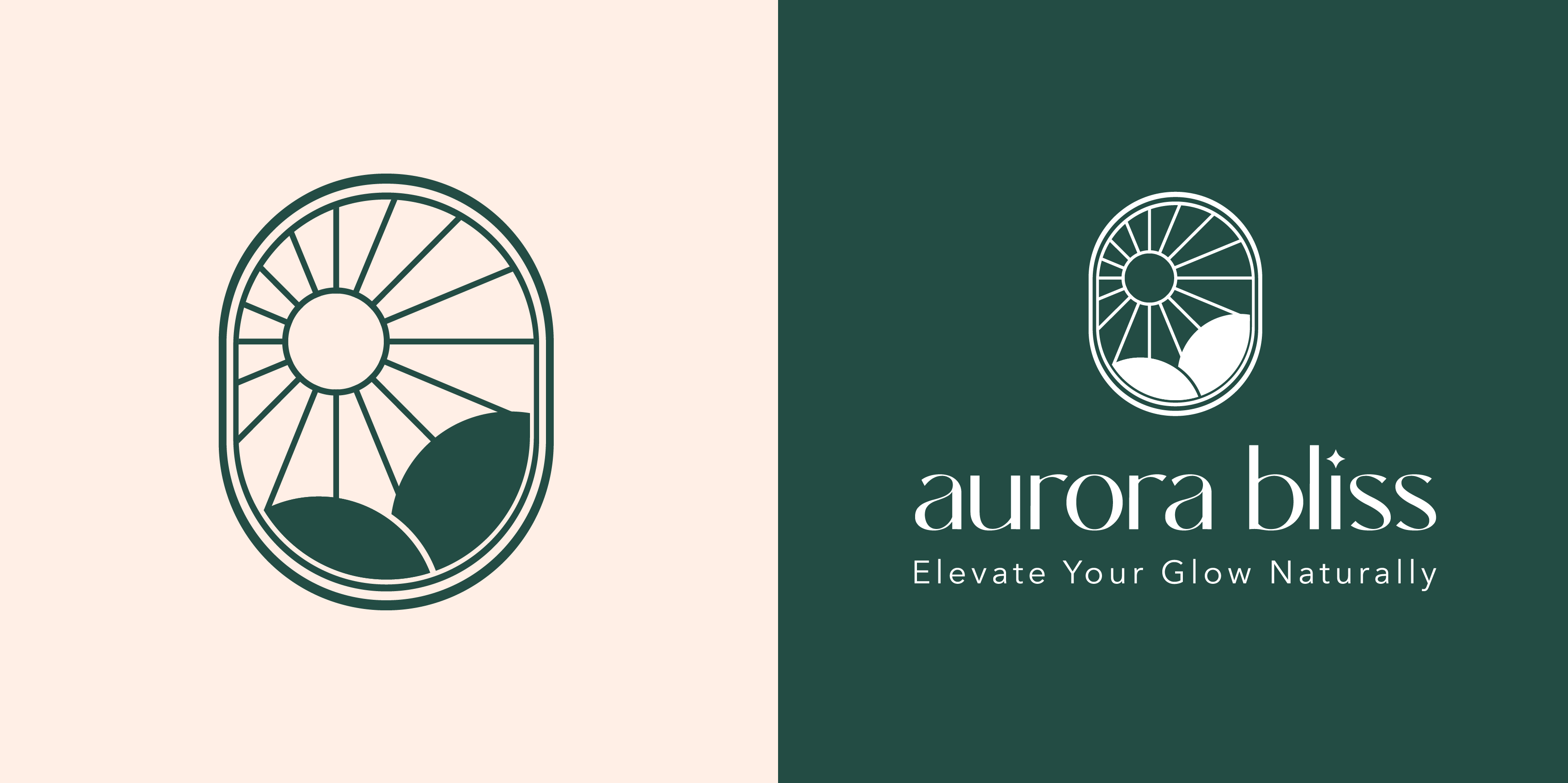
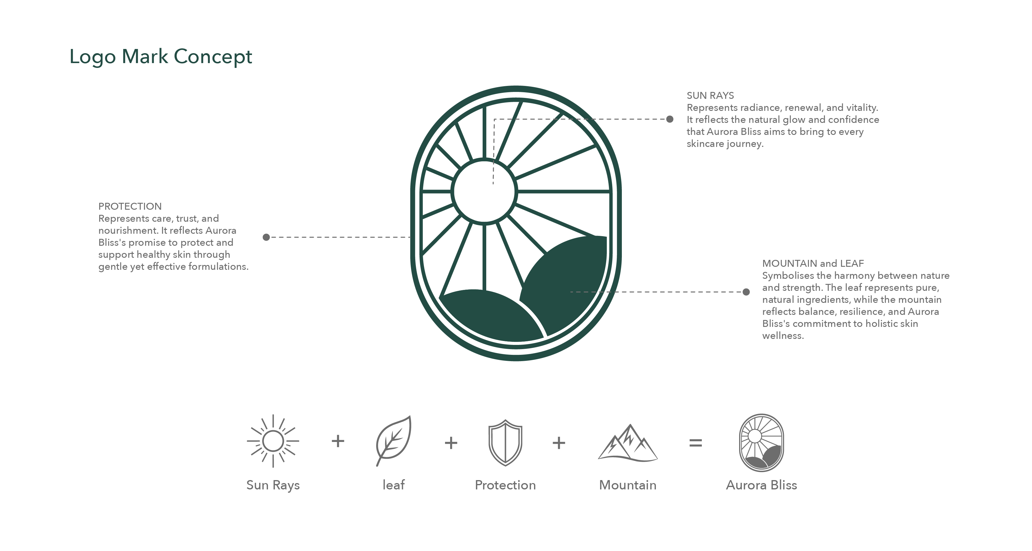
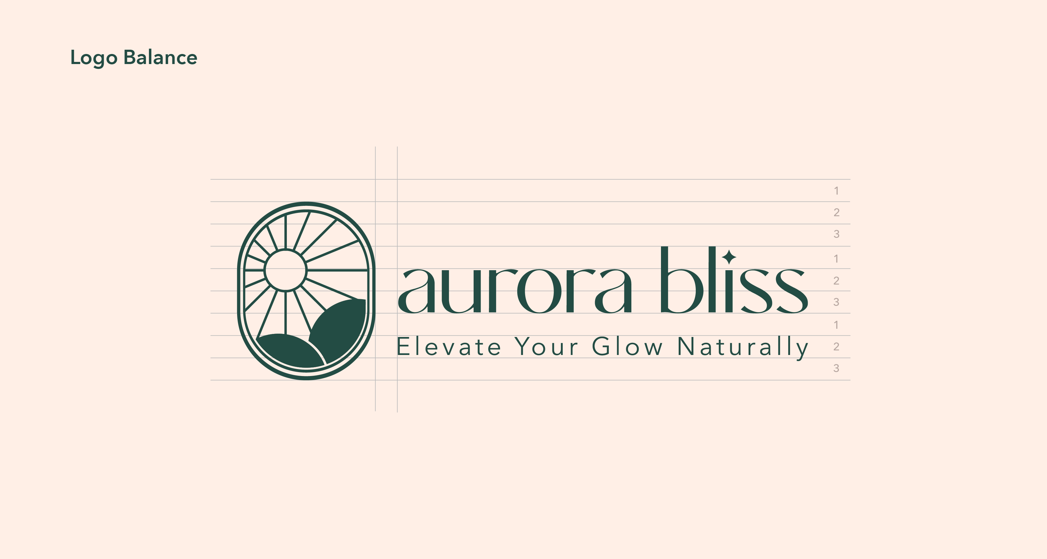
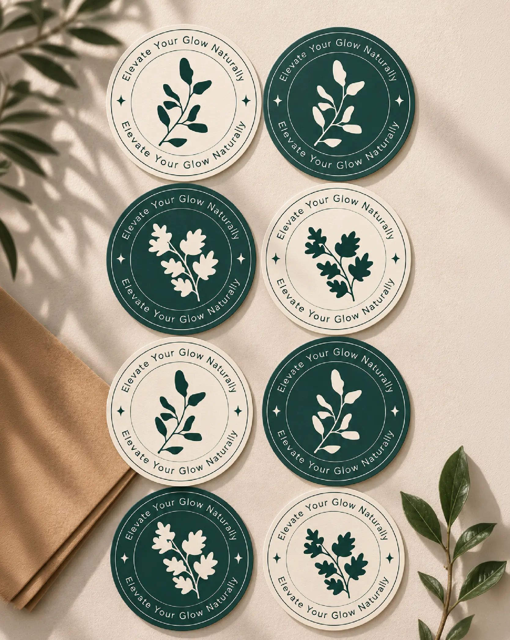
The visual identity for Aurora Bliss is inspired by the harmony between nature, wellness, and renewal. The logo mark combines four meaningful elements: sun rays, a leaf, mountains, and a protective frame. The sun rays represent radiance, vitality, and the natural glow that healthy skin brings. The leaf symbolises purity, botanical ingredients, and the brand's connection to nature. The mountain reflects balance, resilience, and holistic well-being, while the enclosing shape conveys protection, trust, and care.
Paired with a refined serif wordmark and a nature-inspired colour palette, the identity creates a sense of sophistication, calmness, and authenticity. Together, these elements communicate Aurora Bliss's mission of delivering luxurious skincare experiences that nurture the skin, inspire confidence, and promote a deeper connection with nature.
Showcasing creative projects across branding and packaging design.
Explore on Behance